Loading the data from the Google sheet and cleaning it:
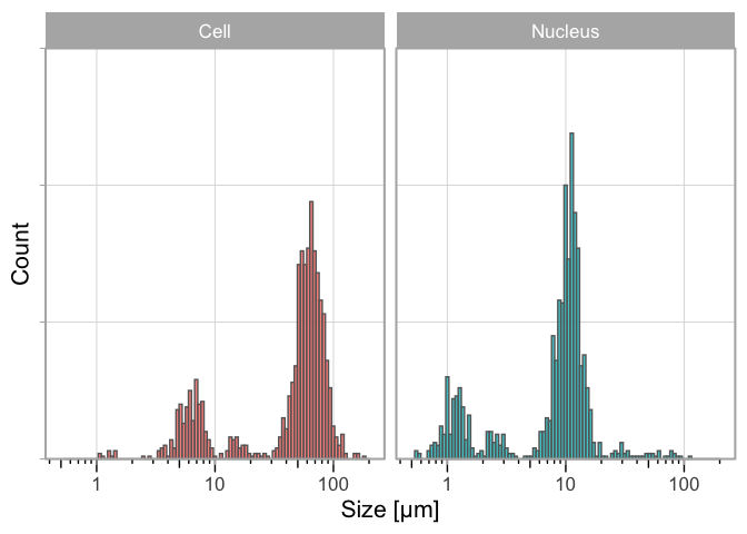
The tidy data sheet df is used as an input for the plot that shows the distribution:
In [1]:
ggplot(df, aes(x=Size, fill=Sample)) + geom_histogram(bins =100, alpha=.8, color='grey40') +# scale_x_log10() + labs(y="Count", x="Size [µm]") +# coord_cartesian(xlim = c(0.5,120)) + theme_light(base_size =16) + theme(axis.text.y = element_blank()) + facet_wrap(~Sample) + theme(legend.position ="none") +#Force the y-axis to start at zero scale_y_continuous(expand = c(0, NA), limits = c(0,150)) +#Apply a logarithmic scale to the x-axis and set the numbers for the scale scale_x_log10(breaks = c(1,10,100), limits = c(.5,200)) +#Remove minor gridlines theme(panel.grid.minor = element_blank()) +#Add ticks to the bottom, outside annotation_logticks(sides="b", outside = TRUE) +#Give a little more space to the log-ticks by adding margin to the top of the x-axis text theme(axis.text.x = element_text(margin = margin(t=8))) +#Needed to see the tcks outside the plot panel coord_cartesian(clip ="off")
Figure 1: Distribution of the measured size of human cheek cells and their nucleus on a log scale. Aggregated data from three consecutive years (2021-2023).
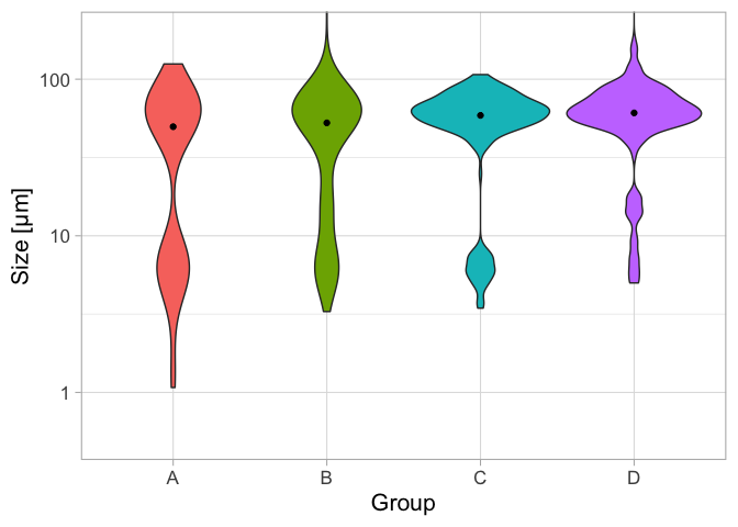
The size data of the Cells is selected and used to plot the distributions as a violin plot per group. The median value is indicated as a black dot:
In [2]:
df_cell <- df %>%filter(Sample =="Cell") p <- ggplot(df_cell, aes(x=Group, y=Size, fill=Group)) p <- p + geom_violin() + stat_summary(fun = median, geom ="point") p <- p + scale_y_log10() p <- p + labs(x="Group", y="Size [µm]") p <- p + coord_cartesian(ylim = c(0.5,200)) p <- p + theme_light(base_size =16) p <- p + theme(legend.position ="none")p